When it comes to your website, words make a BIG difference! Every single word that contributes to user experience on your website matters, even your microcopy.
The importance of microcopy isn’t always a known fact. Notifications, error messages, button text, and other microcopy don’t typically attract much attention from business owners. However, the moment that businesses realize that poorly written content (even bits of it) can cost them their customers is when things start to change!
Those short snippets of text provide users with guidance and information on your site. That’s why lack of clarity, lengthy text, and poorly composed text will not only ruin your website design, but also deteriorate the users’ experience and impression of your company.
It’s time to stop neglecting the microcopy on your site and start giving these tiny words the attention they deserve! Put your effort into creating text that will enhance and improve your audience’s experience. Microcopy has that power.
In this article, we’re breaking down a few key writing tips that will help you enhance the UX impact of your microcopy so you don’t lose any sales due to some poorly written little words.
1. Use Your Brand Voice

These small bits of copy provide you with an often neglected branding opportunity. You may not have lengthy content to express yourself, but this text should still reflect your brand’s personality.
Consistency in content is essential for a professional-looking company website. If your brand is recognizable by its humorous copy, not using the same kind of language across all your text will lessen the experience.
Using your tone and voice will humanize the text. Giving some life to your microcopy allows it to be more effective in building trust and making people comfortable.
Embrace that brand language in every piece of copy. Whether your content exudes a friendly, humorous, professional, or educational tone, let it reflect on the microcopy as well.
2. Make it Understandable
It shouldn’t matter if the user is 7 or 77 years old – people of all ages need to understand your writing.
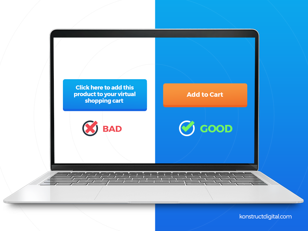
Clarity is best achieved with simple words. They should be your go-to vocabulary.
Simplify your writing to its core. There’s no need to use technical words that reflect your expertise.
The rest of the copy on your website is there as proof of your knowledge and credibility. Microcopy exists to provide guidance and simple information.
3. Get Personal
Do you want to create microcopy that speaks to people? Then, write as if you are addressing them directly!
Add a personal and friendly touch to these small informative bits of text by presenting them as a part of the conversation. For example, “I want to know more” is more personal than “View more.” The conversational tone will make the users’ encounters with microcopy more pleasant.
Use “you,” “I,” and “we” to give website visitors a sense of real conversation. Allow them to feel as if that text is addressing them specifically. Create an atmosphere that says “we care about you.”
4. Keep it Short and Sweet

There’s no room for fluff in microcopy. You need to be concise, direct, and actionable.
Before you finalize it, ask yourself – “can I make this more concise?”
The reason why short microcopy works best is that it is more digestible. Users should take a glance and easily understand their options. They don’t expect to sit around reading notifications and button text for ages, so don’t force them to!
Concise microcopy is more memorable and memorable copy is more likely to inspire action.
5. Take Off the Pressure

Microcopy typically gives guidance for performing a certain action. The commitment that comes with clicking on the CTA can intimidate users.
Aim for less-committing words and phrases when the situation allows it.
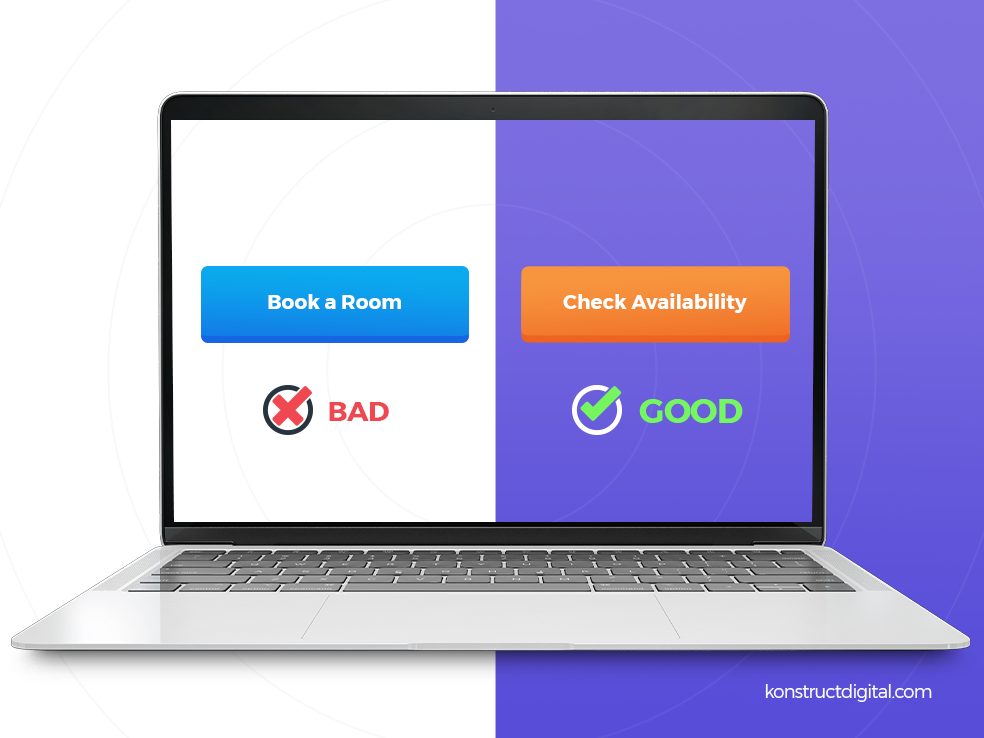
Let’s observe what kind of change happens when you take the pressure off the users. This case study from Google UX writers serves as a great example. They made a simple yet relevant change in their hotel search microcopy, switching from “Book a room” to “Check availability.”
The result?
A 16% increase in engagement for Google hotel search! “Check availability” is simply less commitment. It doesn’t finalize the customer journey but simply opens new possibilities.
When you can choose between commitment and opportunity, it’s always better to create text that signals the second choice – opportunity.
6. Don’t Forget the Importance Patterns

Jacob Nielsen, who coined the Jacob’s Law and dedicated his work to improving UX, explained the relevance of patterns. “Users spend most of their time on other sites. This means that users prefer your site to work the same way as all the other sites they already know,” wrote Jacob.
How does this affect your microcopy, you ask? Well, although creativity is always welcome, familiarity is what drives people to make a decision faster.
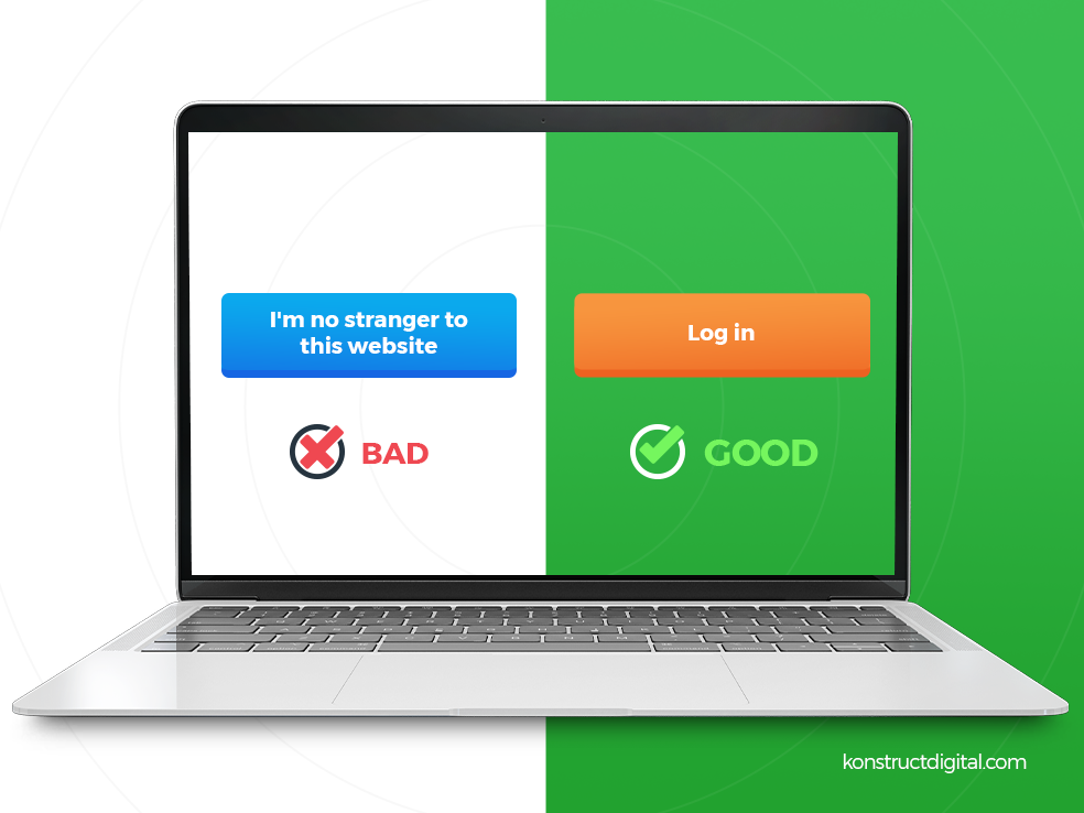
If the users are used to seeing “Log in” and “Create an account” on the Login page, it might confuse them if they see “I’m no stranger to this website” and “I’m a newcomer” CTAs instead.
Recognizable words streamline the users’ experience. They intuitively click on CTAs when they spot familiar words. That’s why harnessing patterns is useful.
Find the balance between familiarity and creativity. Make the microcopy your own, while keeping the keywords that users will instantly recognize.
7. Test the Microcopy
The best way to determine whether your writing speaks to users is to give it a test run. Do A/B testing to see how your target audience responds to your microcopy.
Conducting tests will ensure that you have a data-driven insight into the text’s effectiveness. You will also get a better perspective of what kind of microcopy works best for your target audience.
If you want to continuously make positive impressions, you should look at A/B testing as an ongoing process. Users will change over time and they will come with different preferences. A/B testing will help you keep your microcopy personalized and at the top of its game at all times.
Microcopy Can Have a Macro Impact!
Well-written microcopy encourages action, shows users a path, and makes them feel welcome. Don’t underestimate the part that these tiny words play in the overall consumer experience on your website!
Every text that appears on your website should work towards creating a pleasant, streamlined, and effective user journey. Writing microcopy that speaks to your visitors can help you achieve that goal!
For some inspiration on what vocabulary to use, check out the well-written free content available on Subjecto. Reading high-quality text can spark some great ideas for your site.
If you’re struggling to nail down powerful microcopy for your site, the team at Konstruct can help! We can turn the small snippets of copy on your site into effective conversion tools. Stop losing out on potential customers and start boosting your conversion rates today!
Need help with B2B Content?
Learn more about Konstruct's B2B Content Services
More B2B Content Resources
- Should You Replace Your Content Marketer with AI? Maybe…
- LinkedIn B2B Marketing Examples That Made Us Say, “$h!t, I wish I thought of that!”
- 9 B2B Social Media Dos and Don’ts That’ll Change Your Social Game
- Stop Snoozing on These 7 B2B Content Marketing Trends
- B2B Marketing Copywriting: 10 Tips for Writing Persuasive Copy for Today’s B2B Buyers
- 9 Wow-Worthy B2B Content Marketing Examples To Inspire Your Content Strategy
- 8 Irrefutable B2B Social Media Marketing Benefits
- The Proven Formula for a Rock-Solid LinkedIn Content Strategy
- Content Marketing Statistics: The Facts You Can’t Afford to Ignore
- 999,999 Tips for Creating On-Brand SEO Content


